|
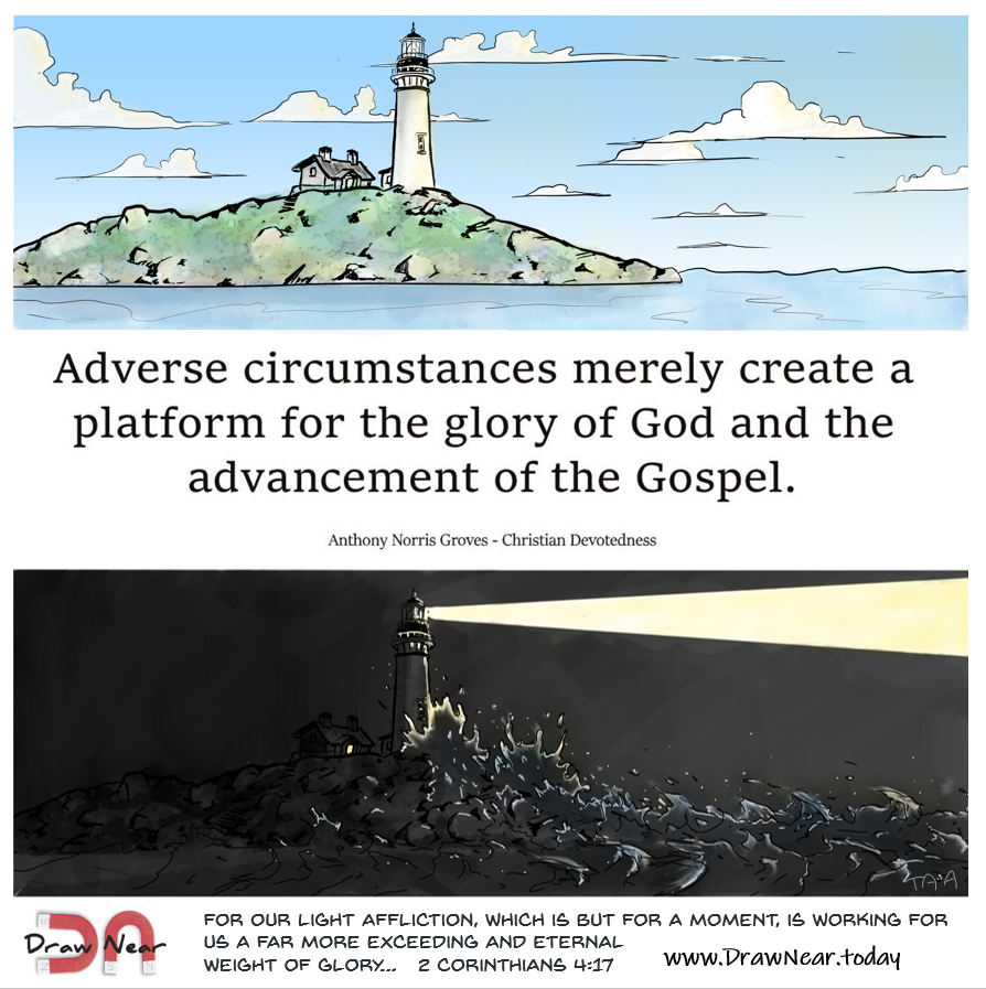
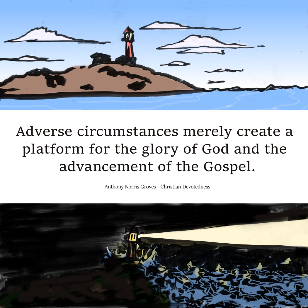
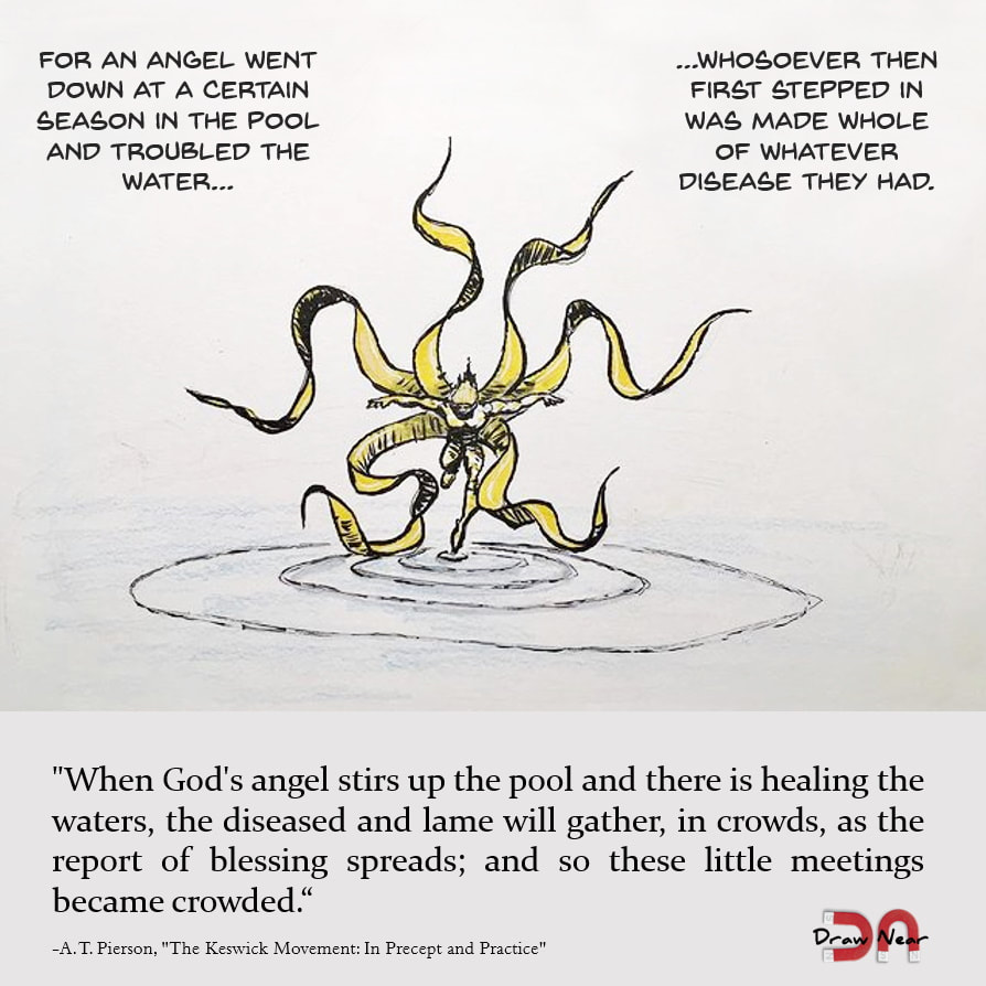
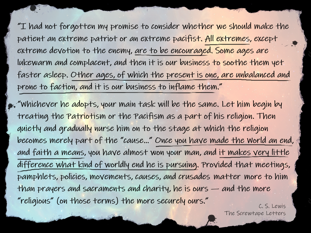
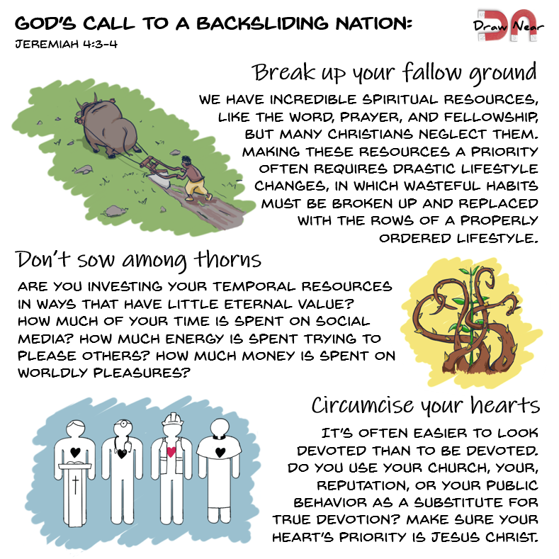
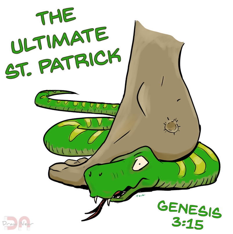
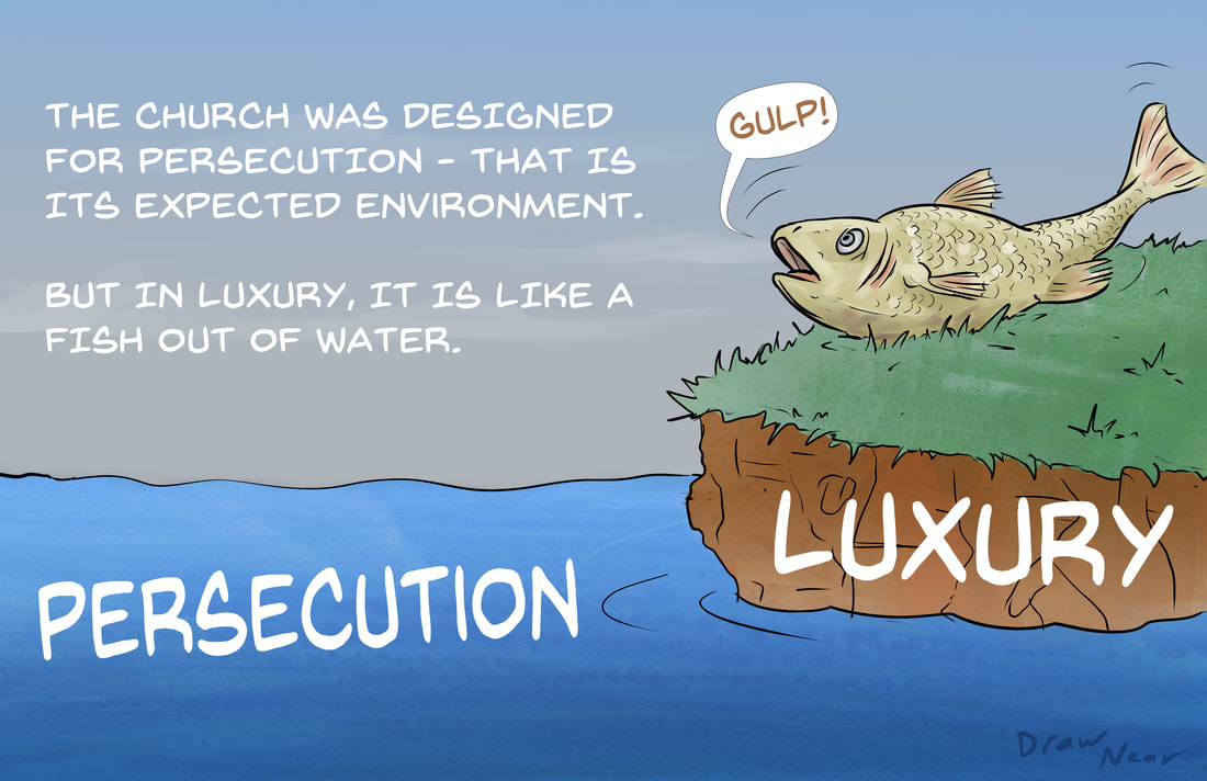
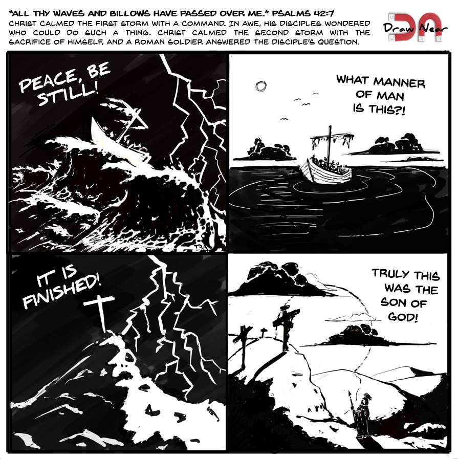
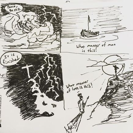
This is the first in a series of posts about God's provision for all. Each post will highlight a biblical account where God's provision was effectively unlimited. The reference is from Exodus 12:23. This is another "HD Remaster" of an older concept. The original, below, was drawn on a whiteboard sometime back in the fall of 2020. I took a picture of it and later colored it in Paint.net. The new one took a lot longer, but there was a ton of experimentation with Sketchbook Pro, so it took longer than it should have. The quote is from R. C. Chapman. He has the honor of being the first person quoted twice on here. I drew this for Inktober in Oct of 2019, but revived it for this A. T. Pierson quote. If you're curious about church history, check out Pierson's account of this period. It's a pretty short read and lots of good stuff in it. In C. S. Lewis' The Screwtape Letters, Lewis imagines a seasoned demon instructing a rather inept pupil. Rarely has a book so perfectly captured the nature of man. In this particular admonition, the elder demon encourages the inflammation of "all extremes, except extreme devotion to the enemy [God]." These include both patriotism and pacifism. I find this important to understand in today's political and social climate. Extremes become our guiding principles, pushing our Faith into the realm of simple support for our extreme. This was the first post where I had both Draw Near as a "real thing" and a didactic message in mind. It really pushes the limit on how much text I can fit in this format... but it also closer to what I really hope to make Draw Near into. My wife Christina suggested the colored backgrounds on the second and third images, which was a brilliant idea and really brought the whole post together, artistically speaking. The passage it's based on (Jeremiah 3:3-4) was one that I came across during my morning Bible reading. It strongly convicted me, especially in the area of responding to stuff on the internet, where I could spend 25 minutes crafting a YouTube comment response that only two people will ever read. Alternatively, I could pray for a missionary friend... or make a new DN blog post. :) The first two images were another artistic experiment. I used a (mostly) non-pressure sensitive brush, kind of like using a Micron pen instead of a brush pen. I also stuck to 3 tone (base, shading, and highlights) coloring with no blending. It made drawing a lot easier and still looks good. Not sure yet how it's going to look on larger images. Stephen Westerholm's "Preface to the Study of Paul" is an excellent and in-depth primer for those looking for a broad overview of the book. This is a quote from one of Westerholm's footnotes to his discussion of Romans 9:17-18. It's my personal belief that God found the biggest donkey in all of Egypt and put him on the throne at just the right time. Interesting thing to think about when we're contemplating leadership in this realm. This was the second doctrinal / devotional image I did with the XP-Pen digitizer, but the first to get stamped with the Draw Near logo. I water-marked this one, but later ones have the logo clearly visible. Artistically, I did a fair amount of shading. I still haven't made up my mind whether or not I like it like this, or more like later ones where the shading is simple 3 tone - base, shade, and highlights - with no blending. If you aren't familiar with the story the image is riffing on, it is said that the reason there aren't any snakes in Ireland is that Patrick, the "Apostle to Ireland," drove them all into the sea. St. Patrick is actually a fascinating character. He was born during the early 400's to a Roman family in Britan but was kidnapped as a teen and sold into slavery in Ireland. After six years he escaped, but returned to bring the gospel to the residents of Ireland. The reference here is that Christ is the real snake banisher, per Genesis 3:15. His heel is marred from the wounds of the cross, but the serpent's head is being crushed under his foot. This was my first digital drawing for Draw Near. If you look closely, you can see that I drew in the words "Draw Near" in the bottom right. This one is slightly modified from the original. The first, instead of saying "the church is designed for persecution," said "the church thrives in it." I got some pushback on Twitter, with one guy responding, "This is empirically false. Persecution has repeatedly wiped out Christian groups around the world, never to return." I think this criticism misses the point. The church experiences different phases. Sometimes it has prosperity (which is not the same as luxury), sometimes it experiences persecution, and sometimes it experiences dispersal. Wheat grows, ripens, and is cut down to be harvested, both for food and for planting. That's not a failure of the wheat, it is its purpose. Early Christians in Jerusalem experiences tremendous persecution, but they spread it far and wide as they fled. Regardless, I changed the heading because I don't feel like defining the term "thrive" to everyone who reads it, and because the actual point of the drawing was to point out the terrible effects of luxury on the church. This comic started what feels like a long time ago in 2018, with this little sketch on the back of a church bulletin. Some things stayed the same over the last 4 1/2 years. The bottom left pane is nearly identical. But the biggest change is the bottom right pane. I actually think the old one reads a little better - The top and bottom phrases are very similar: "What manner of man is this?" from Mark 4:41 (I used the KJV version, thanks to my parent's insistence on Bible memorization), and "What manner of love is this?" - slightly paraphrased from 1 John 3:1. But I felt that it wasn't really accurate to put those words in the centurion's mouth, so I changed it to the words of Mark 15:39.
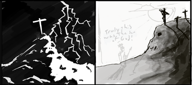
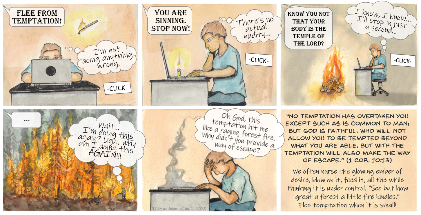
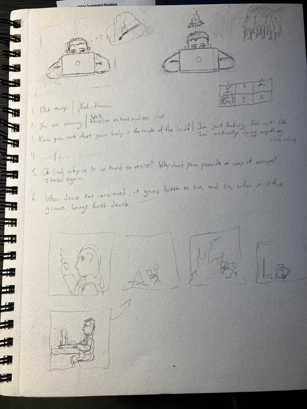
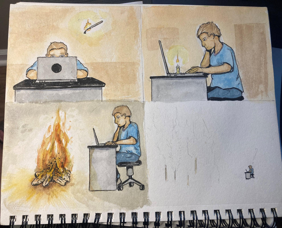
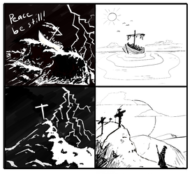 I thought I was nearly done until I stepped back and looked at it, and honestly it looked like Two-Face from Batman. Completely dark on the left, totally white on the right. The solution was to color the ocean black, add a lot of stark shadows, and put in some dark clouds. A professional artist, Simone Grünewald, recently critiqued another drawing of mine, correctly calling my clouds "timid." So I was a little braver with these. Anyway, you can compare this to the top drawing and see the difference. It was a learning experience, but I think it turned out well! I got the idea for this one from a Mike Winger video (but I can't remember which one). In it he answered a listener question about why it seemed like God didn't always provide a way of escape. In his case, he nearly burned down his neighborhood playing with fire as a kid. He knew he shouldn't be playing with fire, but he did it anyway, not expecting the little flame to spread so quickly in the dry brush. We tend to play with temptation, but when it turns into a big fire, -then- we wonder how that could have happened. This was 100% watercolor and brush pen, and took about three days of working on and off. I sketched it, then used a lightboard to redraw. Then I inked on the new clean drawing. I also did these all pretty large, about 5x7", then scanned them and stitched them together. Below is the original brainstorming page, along with one of the pages of final watercolor drawings. |


 RSS Feed